Destination marketing just got easier.
Source, manage, and publish user-generated content and short-form video from your locals and visitors.
CrowdRiff customer sees these results on average:
16
Hours saved per week
7x
Lower video prod. costs
45%
More social video views
900+ destinations trust CrowdRiff for their visual content
Sometimes it’s good to follow the crowd.
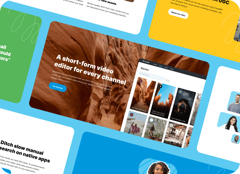
Meet content demands with custom short-form video 📽
The scalable way to fuel your Instagram Reels, TikToks, and YouTube Shorts. Source original short-form video on your creative terms—we’ll handle the logistics (yes, including payments).
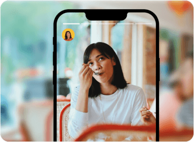
Discover UGC faster than ever 📸
We collect the best user-generated content from your destination. Find what you need with smart curation, breeze through rights approval, and hit publish. Voilà!
Collaborate better with all your visual media in one place 🗂
No more digging through folders, emails, and drives. We centralize your visuals so you can easily search, organize, and share content with your team.

“CrowdRiff has found a home in Destination Cleveland. Whether it’s our website, blog posts, on social, through videos or collecting UGC for email newsletters. It’s really become integrated into our workflows by multiple team members, multiple times per day.”
– Gabe Wasylko, Social Media Manager, Destination Cleveland
Read case study